![]() We have a Discord now - Join if you want to Contribute!
We have a Discord now - Join if you want to Contribute!![]()
Site Updates Coming Soon!
Talk:Item Insurance
Item Insurance Menu
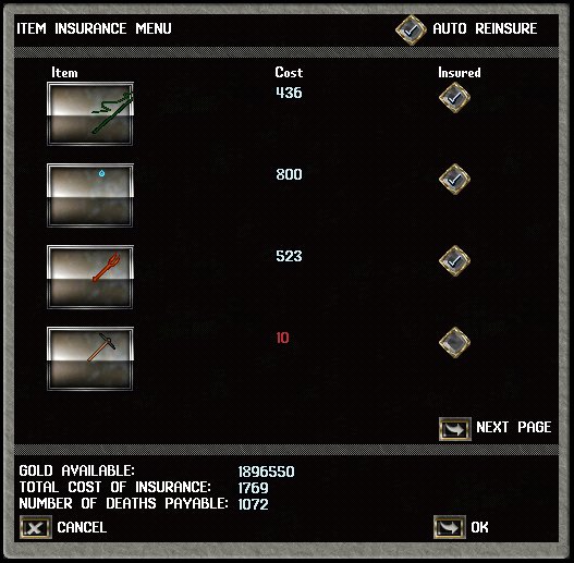
Anyone got some screen shots of the newer insurance menu? --TullyMars 20:31, 18 June 2011 (PDT)
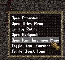
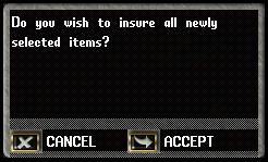
- I can take some, I guess CC screenshots would be better since the menu on CC is scaled appropriately. We can only see four (or five?) items at once in the menu, which items do you think will suit best? Maybe from lower to higher: scissors to an artifact? Shall I screen the "click ok to.." messages too? Nimuaq 21:11, 18 June 2011 (PDT)
- Aye the cc would probably be best, an 800 artifact might be good too. Definitely on the "click ok to". Personal question, what do you use for screenshots in the CC? --TullyMars 16:48, 19 June 2011 (PDT)
- How about these? Can improve them further.

|

|

|
- I pressed Print Screen button to copy the screen and used windows' paint brush to crop the image and save it as jpg. I use png for item images since png doesn't use compression and the item images need more detail. You can also set the background of the png image to be transparent, so that it doesnt have a white background when used on a different color table. But using png for large screenshots causes the file size to jump higher than 300 kbs while jpg compresses it to 65 kb. Paint brush unfortunately uses high compression for jpgs so I sometimes use other image programs to adjust the compression level for jpg. The only policy we have on images is for their naming: the image name should be exactly the same as the item name for item images, with an uppercase first letter and the rest is lowercase: eg. For: Chronicle of the Gargoyle Queen Vol. I, image name is "Chronicle of the gargoyle queen vol. I.png" (
 ).Nimuaq 15:19, 20 June 2011 (PDT)
- I pressed Print Screen button to copy the screen and used windows' paint brush to crop the image and save it as jpg. I use png for item images since png doesn't use compression and the item images need more detail. You can also set the background of the png image to be transparent, so that it doesnt have a white background when used on a different color table. But using png for large screenshots causes the file size to jump higher than 300 kbs while jpg compresses it to 65 kb. Paint brush unfortunately uses high compression for jpgs so I sometimes use other image programs to adjust the compression level for jpg. The only policy we have on images is for their naming: the image name should be exactly the same as the item name for item images, with an uppercase first letter and the rest is lowercase: eg. For: Chronicle of the Gargoyle Queen Vol. I, image name is "Chronicle of the gargoyle queen vol. I.png" (